When it comes to images on a website, there are two major players. There is the HTML (Hypertext Markup Language) <img> tag and there is the CSS (Cascading Style Sheet) background image property. We will discuss the pro’s and con’s of each of them and when it is beneficial to use one over the other.
HTML <img> tags
Pros:
- Search engine and screen reader friendly. With <img> tags, there is the option to add ‘alt’ and ‘title’ text within the code or in the backend of a CMS system such as WordPress. The alt and title attributes can be picked up by search engines and screen readers. Search engines such as Google can’t read images themselves but can read this information, so by filling this in with keywords and relevant information it can positively impact your search engine optimisation.

- With <img> tags, your web browser makes requests as the HTML code is parsed. This means that even if your image is a large file and taking a long time to load (hopefully this isn’t the case!), everything in the code before the <img> tag will load first, allowing a user to start reading/looking at the content without having to wait until the image has been loaded. This is very important as if the user is made to wait for content, there is an extremely high chance that they will leave your website.
Cons:
- Images included via <img> tags can be difficult to work with sometimes. It takes extra work to get the image to look good under constrained proportions. <img> tag images constrain the height and width proportionally meaning that when trying to fit an image into a small space, a larger image can become very thin and difficult to see properly. You can set the width and height of the image to fixed proportions, however, this has its own issue, the image may look good at a certain size but alter this in any way and the image will lose its proportions and look stretched.
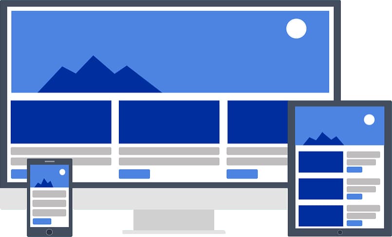
- This links into responsive environments, an image may look great on a desktop screen but bring things down to mobile and suddenly a large banner image can become very thin. This means the mobile design may need to be changed to accommodate the different image proportions. There is a way around this such as using responsive images, where the same image is pulled through at different sizes depending on screen size, however, this takes much more work.
CSS Background Images
Pros:
- Background images are easy to display properly even at constrained proportions. Attributes such as background-size: cover; allow the image to fill the space while still keeping its proportions.
- Overlaying content over the top of a background image is very easy as you can simply treat it as if there was no image there so you can just apply regular positioning to any elements over the background image.
Cons:
- As background images are declared within a CSS file, search engines and screen readers can not read them. This means that if the image is valuable to the content on the page, there is no way for a search engine like Google to gain any of that information as background images do not have the option for ‘alt’ or ‘title’ text.
- If you have a large number of background images within your CSS file, a web browser such as Google Chrome will take a lot longer to parse the CSS file and pull the images from it and this will delay the loading of the entire page, potentially causing visitors to leave your website.
If you are unsure whether to use an <img> tag or a background image, simply ask yourself, does the image help people to better understand the content? If the answer is yes, then you should be using an <img> tag. If the image is purely for design purposes then there is no harm in using a background image.
Image File Size Is Important
No matter which way you choose to include images on your website, you will need to resize and compress them first. High resolution imagery is the norm in the world of print design, but on the web, massive images can cause your page to load way too slowly hurting the user experience. However, using too small of an image and then trying to blow it up can cause a loss of clarity as the image will become pixelated, its all about finding a good balance between file size and resolution.
So what should you aim for in terms of file size? If you are optimising for SEO, you should try to aim for a maximum image file size of around 100kb but it’s not the end of the world if its slightly higher than this. If your image file size is extremely large, it means that either the resolution of the image is too high or the dimensions of the image are too large.
Resolution is the quality of the image and it is measured in dots per inch (dpi). What resolution should your web images be? With professionally printed work, a dpi of 300 would be expected, however, a lot of computer monitors will not be able to display dpi that high so a dpi that high would not be ideal for the web. Previously, the general consensus was to save images for the web at 72 dpi as this was the highest that computer monitors could show. However, this practice has become very outdated, there are computers monitors out there such as the retina screens on Mac’s, that can display dpi in excess of 200. In modern web design, it has become a balancing act to keep images looking good while still maintaining reasonable file sizes.
My image file sizes are huge, what can I do?
- Reduce the dimensions: If the dimensions of your image are unnecessarily big you can simply reduce them, there’s no point in having an image that is 4000 pixels wide when the maximum size it is going to be displayed at is only 800 pixels wide. Just make sure when changing the dimensions of an image, to keep the proportions the same so that the image does not end up looking distorted.
- Reduce the resolution: Most image editing applications will allow you to save your image with a reduced resolution that is more web friendly. For example, Adobe Photoshop has a ‘save for web’ option that will automatically save an image using web optimised settings.
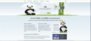
- Use a free tool: There are free tools out there such as TinyPNG and ImageOptim that will compress your images while still preserving the quality of them. They are very simple to use, you just simply set the level of compression and drop your images in, it’s that easy.

Posted in Web Wednesdays