When it comes to designing a website, the correct use of colour is often overlooked. In many cases, colours are used without any thought behind them, simply because they ‘look nice’ or because of personal preference. Just because you like a colour doesn’t make it the best choice! Colour in web design is so important, to the point where bad colour choices or colours not suited to a target audience can cause visitors to a website to behave differently to what is expected. Hopefully, this article will explain how to pick the correct colours for a website by going through the different things to consider when choosing colours.
Colour Theory
There is so much to colour theory that it would not be possible to cover everything within this article, so we’ll just stick to what is relevant to website design, of which there are three main points to consider:
Contrast – In terms of colour, contrast is simply the difference between two colours. In web design, various parts of a page will have different levels of contrast, but the most important sections to take note of is where there is text on a background. A high level of contrast is ideal here to aid readability, which is why you will find it quite common to find black/dark grey text on a white background, as black and white create the most contrast possible. There are various online tools out there which will allow you to test contrast, here is an example of a great contrast checker called Colorable.
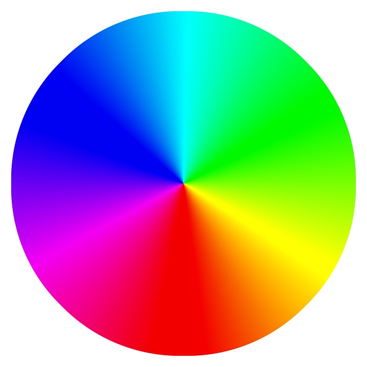
Complementation – Complementary colours are those that are opposite each other on a colour wheel. These colours compliment one another and help things stand out, but can be tricky to pull off in large quantities. Take a look at the colour wheel below to see how complementary colours work, simply choose a colour, then take a look at the colour directly opposite it on the wheel, for example, yellow compliments blue.
Vibrancy – Every colour can invoke specific moods, meaning different colours can affect users of a website in different ways. Warmer and brighter colours such as orange, yellow and red tend to make users more alert and cool dark colours such as purple, green and blue tend to be more tranquil and envoke calmness. This is why on some websites you may see some sections in bright red, as the designer will want to alert the user to these sections.
The Psychology Of Colour In Web Design
The use of colour in web design is extremely powerful. The psychology of colour can help to portray a subconscious message about your business as well as guiding visitors of your website towards specific content or actions, essentially it can be used to ‘control’ how visitors act on your website.
By understanding how colour affects people, you can ensure that the colours used on your website are working in your favour and not hindering you in any way. We will go through some basic colours and look at the psychology associated with them.
Red

Red is one of the more difficult colours to get right in web design as it has both positive and negative associations. Red is associated with excitement, love, movement and energy, but on the flip side, it is also linked to violence, anger, fire and danger.
When to use red – Red is a colour that should definitely be used sparingly. It can be used to bring attention to something such as temporary opening times. It is a great colour to use for error messages such as when a user misses out a field on a contact form.
When to avoid red – Red is not suited to certain types of businesses, such as those selling natural products, professional companies such as law firms or businesses selling luxury goods.
Yellow

Like with red, yellow is also a colour that is difficult to work with as it has both positive and negative associations. Yellow can portray happiness, youth and optimism but also cheapness and cowardice.
When to use yellow – Yellow is a great way to create a sense of happiness and used in lighter shades it also has a calming effect. It can also be a great way to draw attention to call to actions and buttons.
When to avoid yellow – Yellow can become overpowering very quickly if used too much and too much yellow can cause a website to feel cheap.
Green

Green, in general, is a very positive colour. It has a great balancing effect and has many positive connotations associated with it such as health, medicine, wealth, peace and support. Green is also the easiest colour for the eye to process.
When to use green – If you are looking to relax the user or create a calming effect, use of the colour green is a great way to do this. Green is a great colour if your website is about science, healthcare, human resources or tourism.
When to avoid green – Green is not suited to websites showcasing technology or luxury goods as it is more associated with nature and natural products.
Blue

Blue is another colour that mostly only has positive associations. Blue is associated with reliability, loyalty, strength and security. You will also often see blue used on the websites of healthcare companies as blue is also associated with sterile environments. Blue is also the number one colour that appeals to both men and women.
When to use blue – If you want to portray trust, dependability and reliability, blue is a great colour choice. Using blue in different shades can also give out varying messages, lighter shades of blue can give off a sense of friendliness, whereas darker shades can portray strength and reliability.
When to avoid blue – In general, blue is one of the more ‘safe’ colours to use for web design but there are a couple of things to look out for. Too much blue can make your website feel cold and uninviting and using the wrong shade of blue can give off the wrong message. If you are a family run & friendly business you will benefit much more from lighter shades of blue as opposed to darker shades.
We have explored just a few colours, there is so much more revolving around the emotion and psychology of colours that you could write a book! But hopefully, this gives you a bit of an understanding of how important colours can be to your website, if you are interested in a colour that hasn’t been covered, a simple Google search will bring up countless results.
How To Choose The Perfect Colours
Hopefully, you now have more of an understanding of colours and feel comfortable enough to choose your own colour scheme. There are various ways you can go about doing this, one option is to pick your dominant colour and consult a colour wheel to find colours that complement it allowing you to put together a colour palette. There are also online tools that will go through this process for you, these are great as they will accurately pick out the complementary colours, then you can go in and fine tune any colour and the rest of the colours will automatically adapt. A great colour palette tool is Adobe’s Colour Tool as it is laid out really simply and has various options you can tweak to get the perfect colours.
If you any further assistance about website colour schemes, looks & feel then our experienced team of web designers in Leicestershire are more than happy to guide you through what you need to know. Get in touch via the contact form below or call us on 01788 288 800.
Posted in Web Wednesdays